Style recalculations, 60 pointer-move frames
Before598
→After124–184
Step 3: scene registry
The lamp on this site lights what is really in front of it, the glass bends and glows from its own edges, and every shadow comes from one model. This part is how that was built, the questions I kept asking, and the times I was told the result was wrong and why.
I started with one question: what would make a website feel like a room? Not a background image, a room, with a light you hold. When you stop moving the pointer, the lamp comes on. It has a size, so its shadows soften with distance; it fades with distance squared, and it lights a surface less the more sideways it falls. Those aren't effects I added. They are what light does, and once the lamp obeyed them, everything else that used light inherited them for free.
The first versions were wrong in ways I could see and the maths couldn't. Two notes from 29 September: “the bloom is a little strong”, and “you should never be able to see the top and bottom at the same time”. Neither is an equation. Each describes a picture, and the job of the technical side is to turn a picture into a rule it can obey. “Never see both edges” became a rule about which faces of a pane are visible from where you stand.
The rule “you should never see the top and bottom at the same time” is art direction in one sentence, and it was the exact thing the geometry had got wrong. The creative instinct finds the bug; the engineering fixes it for every case, not just the one I saw.
Drag to move the pane. width on screen = offset × thickness / (distance + thickness), for an 18 px pane seen from 1,536 px, 160 px tall in this sketch. The sketch is drawn far thicker than life.
Frosted glass only reads as glass if it has an edge with thickness and something to bend and blur behind it. So every pane is a material: float glass is faintly green (an early version had rainbow sides; the real thing is green), its sides are seen from the front by a few pixels of perspective, and its bevel throws a sharp band of light rather than a line.
The decision I'm proudest of is dull: the bend, the light and the shadow at the edge line up because they come from one edge. A drop of drift between them would look like a filter. On 27 September I rebuilt the pane edges from reference photographs instead of from taste, and on 25 September I had already calibrated the liquid glass against a real interface element. A note from 1 October (“that purple glow on the edges”) went on the same list: a colour the real edge doesn't have.
The turning point of this half was a refactor, not an effect.
That is what lets the rest work. Type throws its own shadow letter by letter, through the glass and on it, and a letter's shadow never lands over its neighbour. Cards throw two shadows, a tight one and a soft one, and never across a neighbouring photograph. A shadow through glass is tinted and softened by what it passed through. Because it is one model, changing a rule changes every shadow on the site together, which is the only way to keep a hundred shadows consistent.
On 28 September, in five steps, every light value was made to come from the lights themselves: the glass and floor passes loop over the lights, the camera became its own module, and the shadow model was shared. The rule since then: effects share causes, they don't each carry their own look. It's why the rain, added a week later, needed no lighting of its own.
A photographer's site should treat photographs like prints. On 11 October the gallery frames became lit surfaces: each print has the paper's gloss, a hard white spot where the lamp mirrors off it, a thin halo, a wide sheen, and a faint curve because real prints bend a degree or two.
I rebuilt the gloss from 50 reference photographs of prints, which is also where the references showed that the spot isn't round: it's a tapering bar along the bend.
The same light that glints off a print is the light that lit the glass and the rain. That's the point of one engine.
The habit. When I can't say what's wrong, I collect fifty real examples and look for what they share that mine doesn't. It turns taste into a list.
“The blacklight effect is terrible. Did you even look up references to what blacklights do and what things look like under black light, and what colors and materials react the strongest?”
My note on the first black-light pass, 1 October 2026
That's the question I ask most: what does the real thing look like, and what reacts? The first pass researched which materials fluoresce and never researched what a black-lit scene looks like. The page was still lit by the room, so under the black light almost nothing changed.
The redo started from the scene: a black light is used in a dark room; what doesn't fluoresce goes dark violet; whites glow blue-white because paper and fabric carry optical brighteners; prints glow in their whites. Then 365 nm and 395 nm lights behaving differently, because they do. It, the neon tube, the road flare, the laser through a prism and the glow paint all live in the same light system, so every one lights the glass and casts shadows with no special case.
“Use real cracks as reference. It's not realistic enough.”
My note, 30 September 2026
The first cracks were smooth rings and a handful of straight lines. I'd said it wasn't realistic, but the useful part was the instruction: use real cracks. So the build went to fracture science. Concentric cracks aren't rings: they're straight segments that stop at the nearest radial crack, so the “ring” is staggered. Later cracks stop at earlier ones. Radials fork as they run, and a harder blow gives more of them.
Then I added my own data: 55 photographed pieces of broken glass, and two crack photographs for laminated glass. Breaks are simulated offline and only the ones whose statistics match real panes become the library the site plays back. On 1 October the pieces were being left tilted by a few degrees in the dent of the blow, and on 2 October I asked for more of the same: some shards protruding or sinking more than the rest, “nothing crazy, but it does happen”.
Step 3: scene registry
Step 5: one scheduler (CSS / liquid glass)
Step 6: one shared context (liquid / CSS)
Numbers from the project log for three of the steps: measuring once a frame, one scheduler and one shared WebGL context.
The least visible part is the one I'd show an engineer first. Between 27 and 30 September the effects went from separate tricks to a small engine: one WebGL context, one scheduler that asks for no frames when the page is still, a compositor that owns every pane layer, and registries for lights and scenes. Each step landed behind a preview switch and waited for me to look at it before it became the default.
The status of every behaviour is written down in a light catalogue (now, preview, planned, or “not visible at this scale” with the reason), so I always know what's real, what's waiting for my approval and what I deliberately left out.
The catalogue as it stood on 30 September, counted by the first word of each row's status.
A new effect runs behind a switch until I've seen it from several views and signed it off. It's slower, and it means the site I publish is the site I've looked at.
I'm open to creative technical project management, founding teams, and agentic AI engineering and research. I read everything that comes in, and I answer.
onysnowstudios@gmail.comLinkedIn →
 The light engine↗
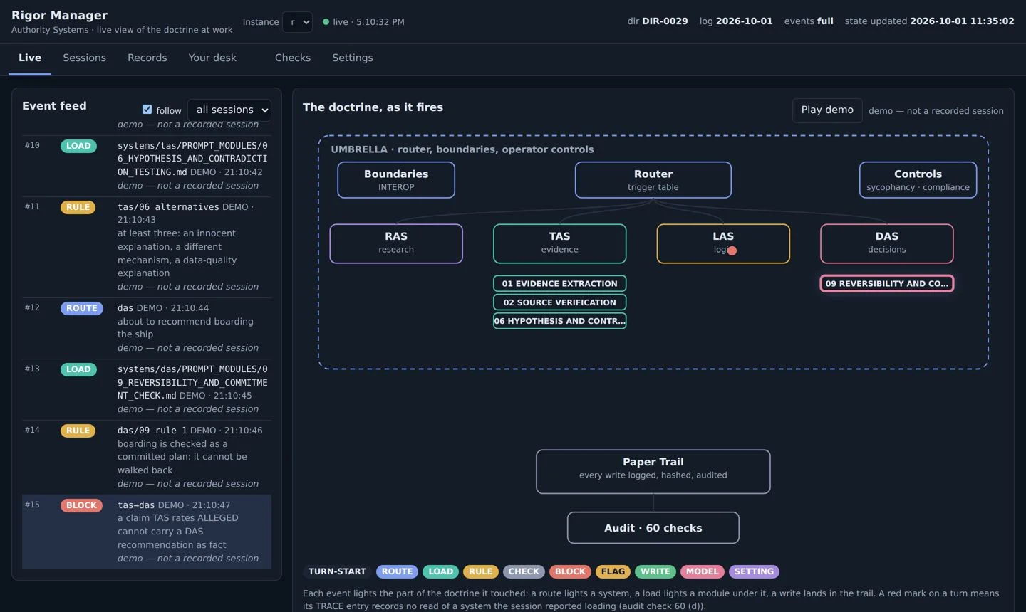 Authority System Suite↗
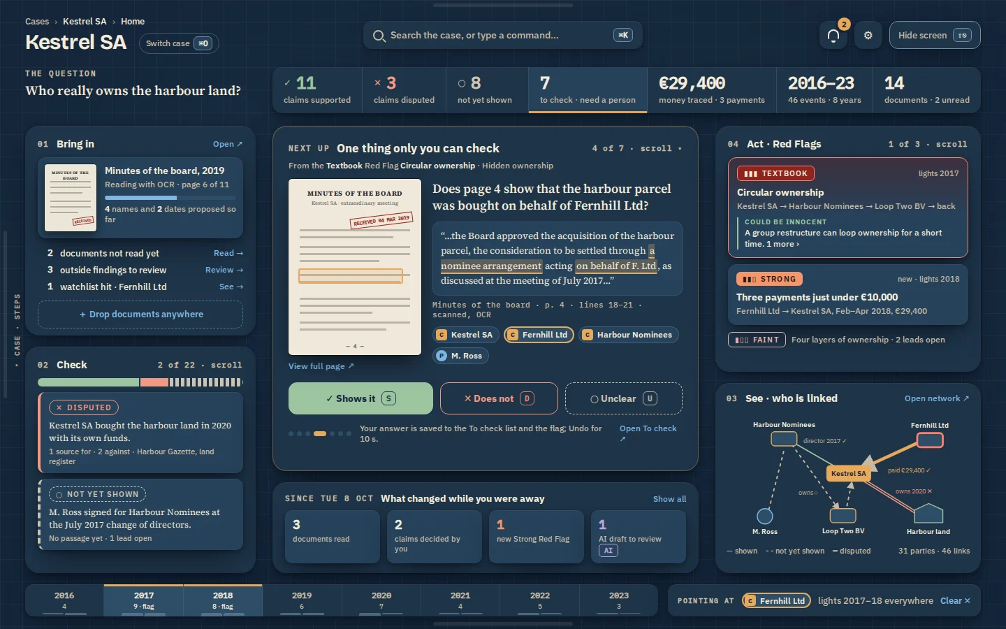 Journalism Workbench↗
 Opallite↗
